A Crypto Exchange That Almost Was: Lessons from Designing a Multi-Currency Crypto Exchange
Summary: Making crypto accessible to everyday people
When I was contacted for this project, the founder had one big ambition: make crypto accessible to everyday people. Many exchanges at the time were clunky, intimidating, or too advanced for newcomers. Over four months, I worked as the solo product designer to craft a platform that balanced simplicity and power. While the project was ultimately called off before launch, my designs earned strong praise from the team and gave me invaluable experience in crypto UX. • Goal: Make crypto more accessible to everyday users. • Role: Solo product designer, collaborated with 2 engineers + 1 PM. • Outcome: Full design system, flows, and prototypes delivered. Project called off pre-launch, but praised internally for usability and clarity.
Problem Framing: Fast crypto adoption was leaving newcomers behind
Crypto adoption was growing fast, but for newcomers, the barrier was often the same: exchanges felt built for experts, not beginners. Pinex wanted to bridge that gap, offering a tool that felt trustworthy and intuitive for first-timers, yet robust enough for seasoned users. • Many crypto platforms were complex and intimidating for beginners. • Opportunity: Build a platform that feels familiar for crypto-savvy users but simple enough for new adopters. • Core product goals from PRD: deposit, swap, send, and withdraw both fiat and crypto.
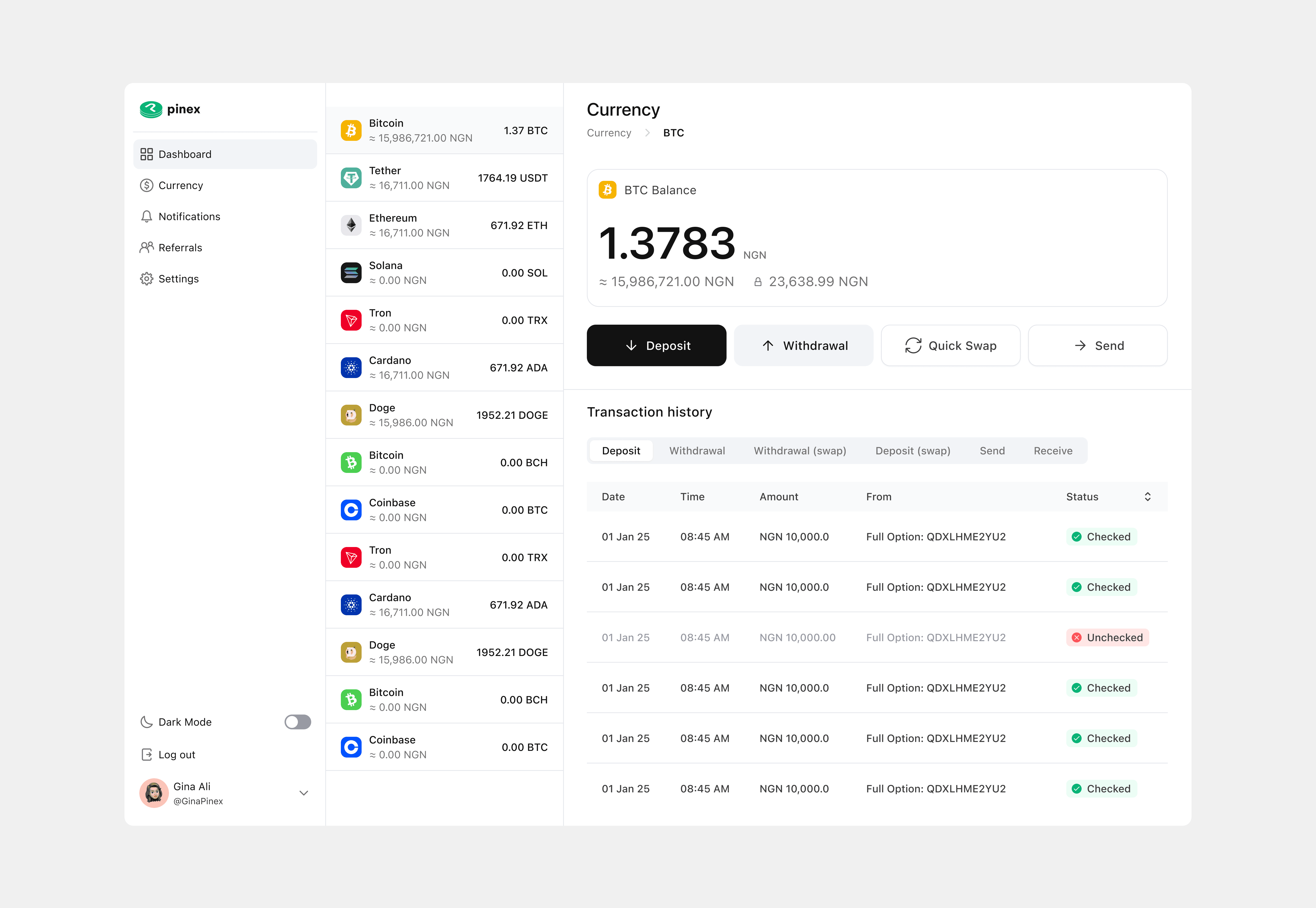
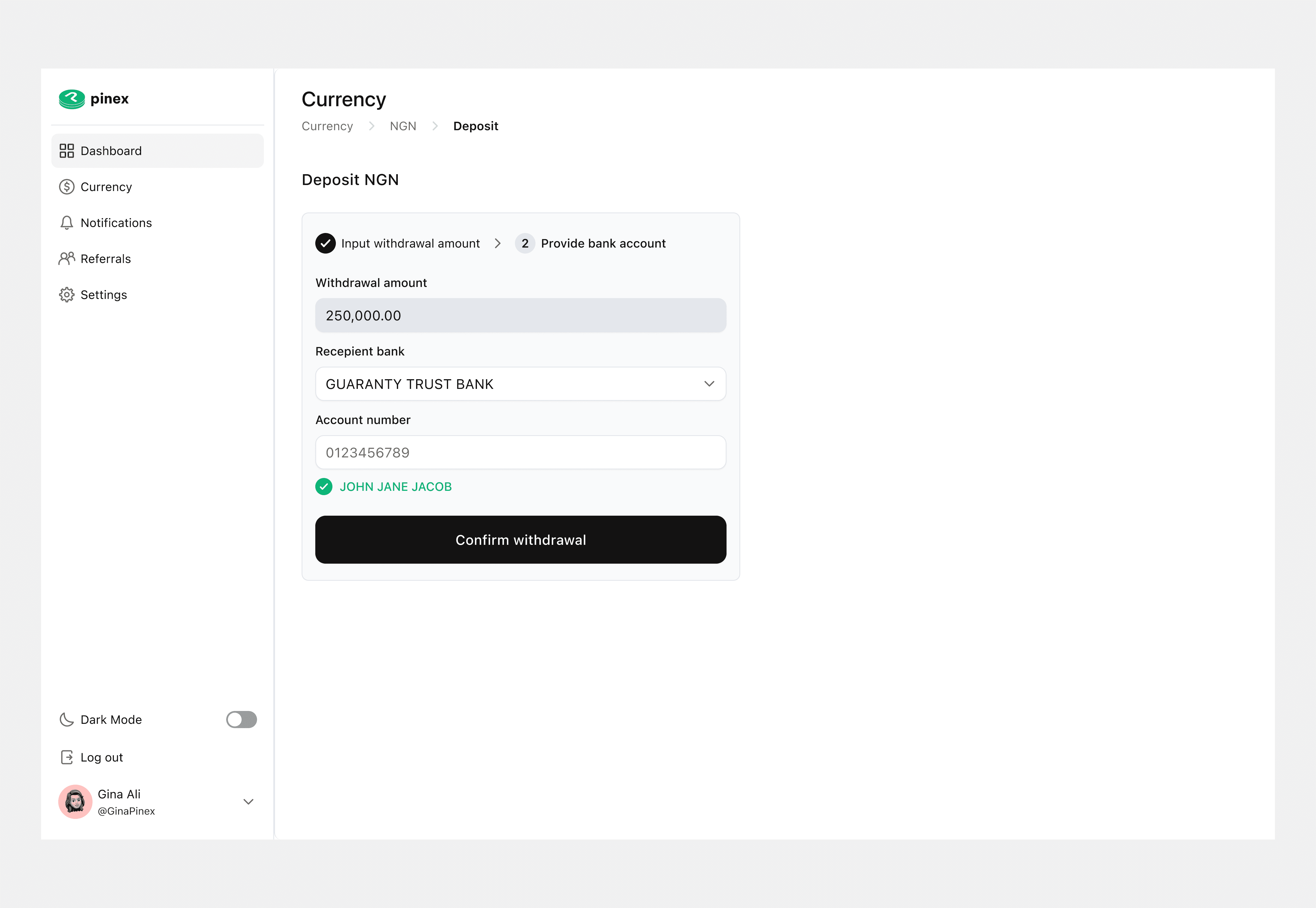
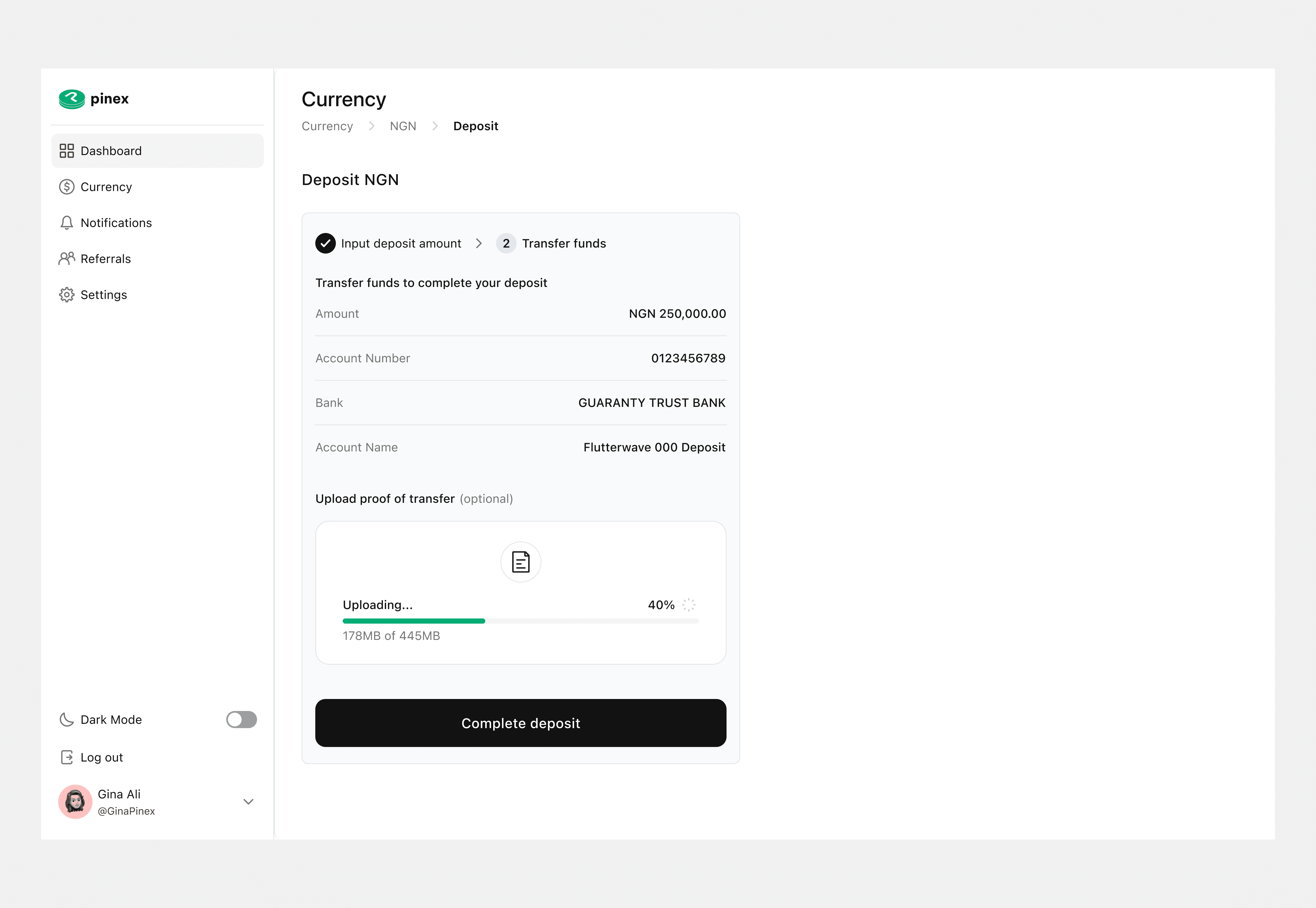
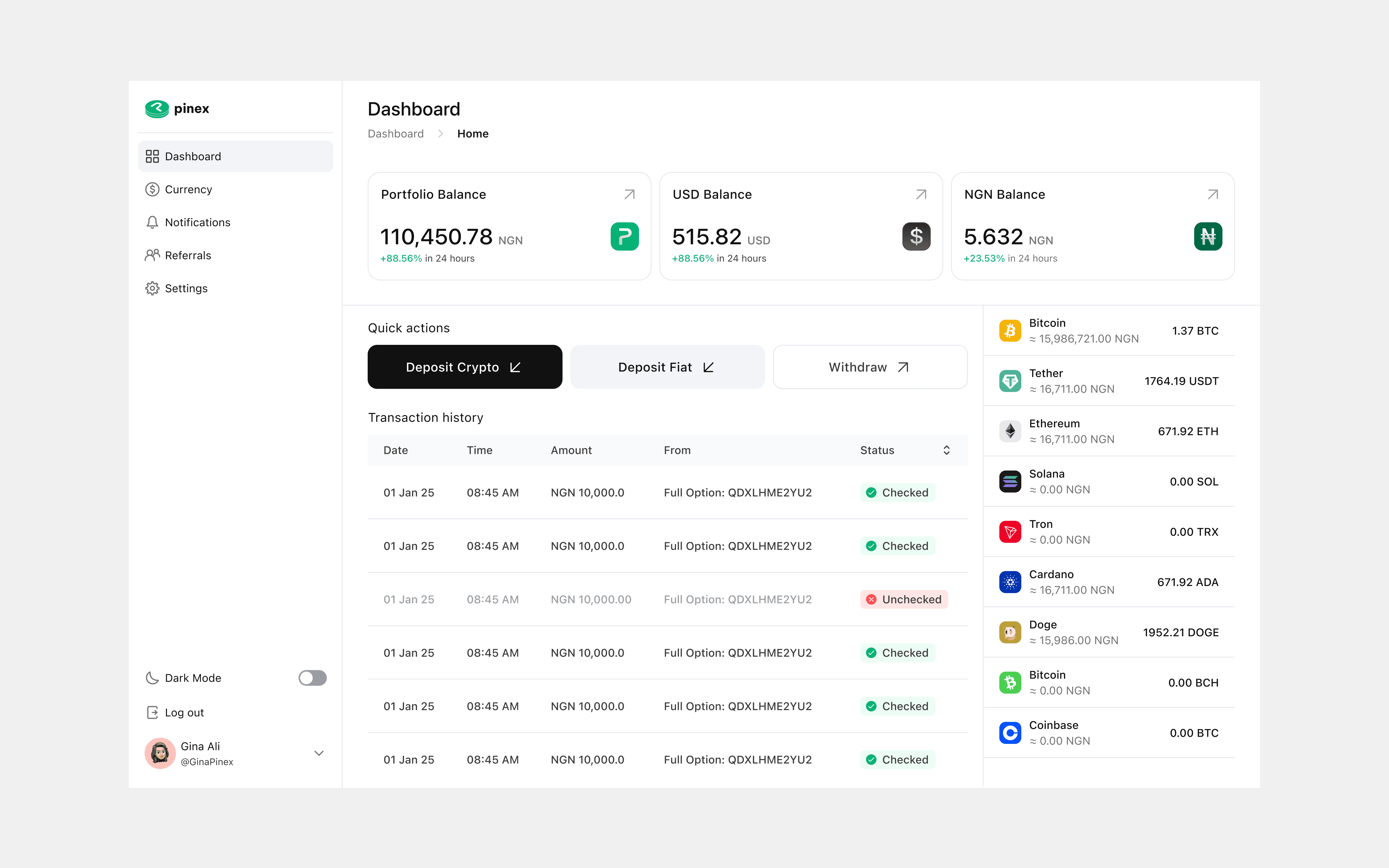
Design Preview: First Impressions Matter
Before we dive deep, here’s a sneak peek. A few key screens to give you an instant sense of the final experience.
Approach: Turning a dense PRD into user flows and design systems
I started by immersing myself in the PRD, dissecting it into user flows and key requirements. From there, I researched competitors like Binance, Quidax, and Yellow Card to understand where users struggled and where we could stand out. Alongside this, I built a lightweight visual identity to give Pinex a consistent and trustworthy look from day one. • Read and annotated the PRD to map requirements → user flows. • Conducted competitive research (Binance, Quidax, Yellow Card). • Ran informal usability tests with peers/team. • Ran iterative internal test cycles, refining flows and interactions under time pressure. • Created lightweight brand system (colors, typography, icons) to ensure trust + consistency.
Challenges: Balancing simplicity for beginners with depth for experts
The biggest hurdle was translating a dense PRD into something that felt natural for users. Crypto dashboards often bombard people with information, so my focus became: how do we make this less overwhelming without losing functionality? This meant making tough decisions about what to prioritize and how to reveal complexity progressively. • Translating a dense PRD into user-friendly, intuitive flows. • Balancing simplicity for beginners with power for experienced users. • Avoiding overwhelming dashboards by focusing on progressive disclosure.
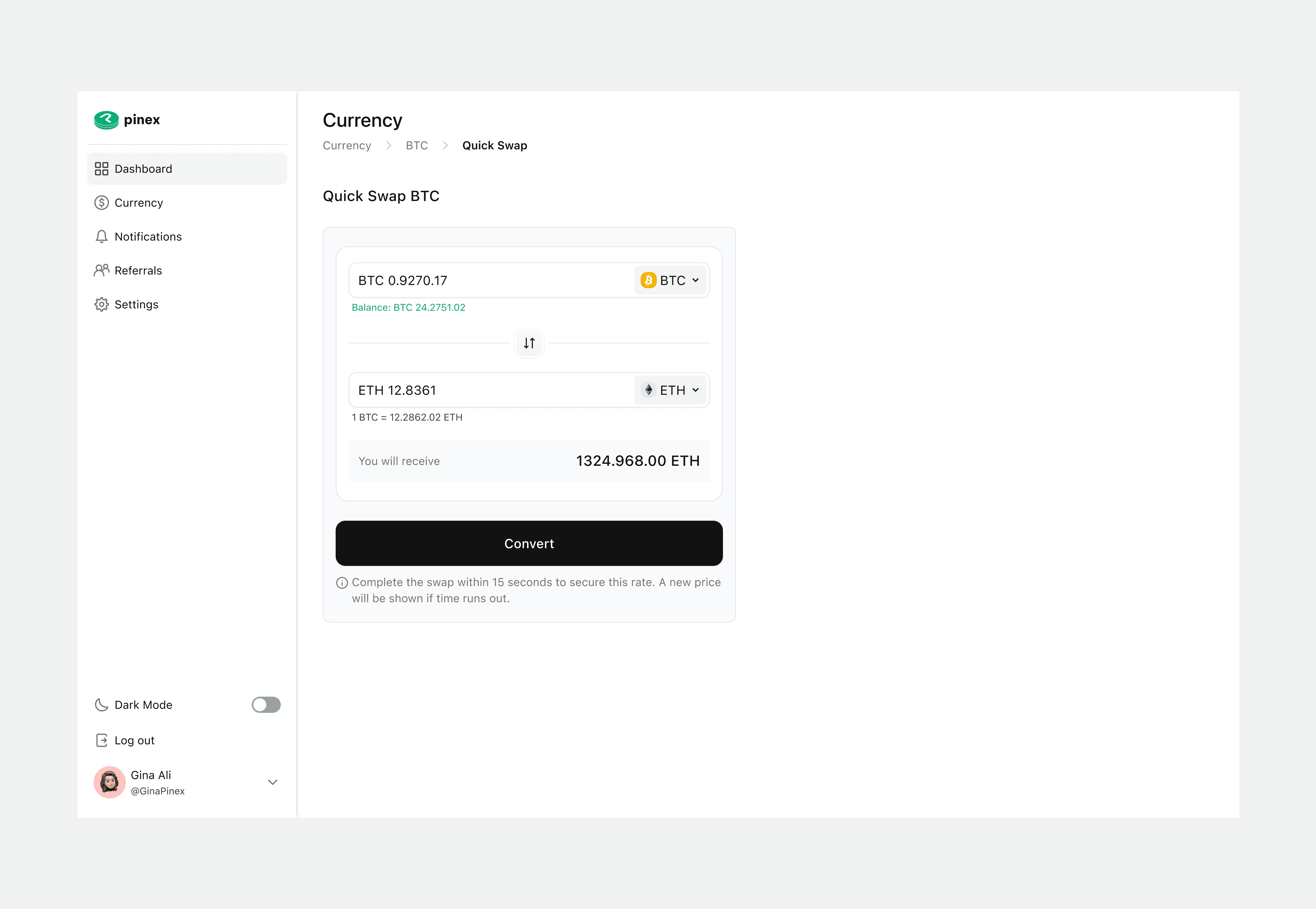
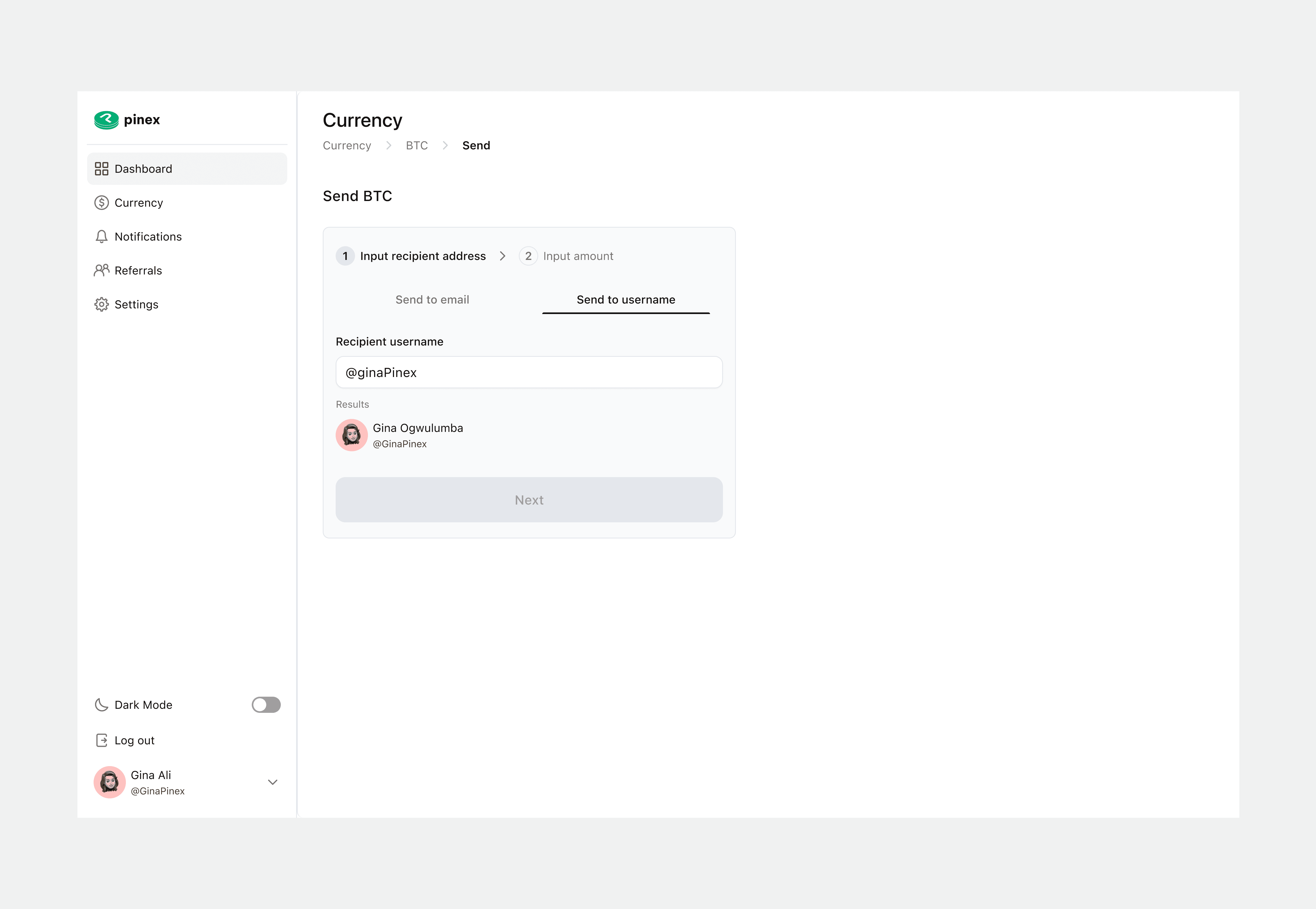
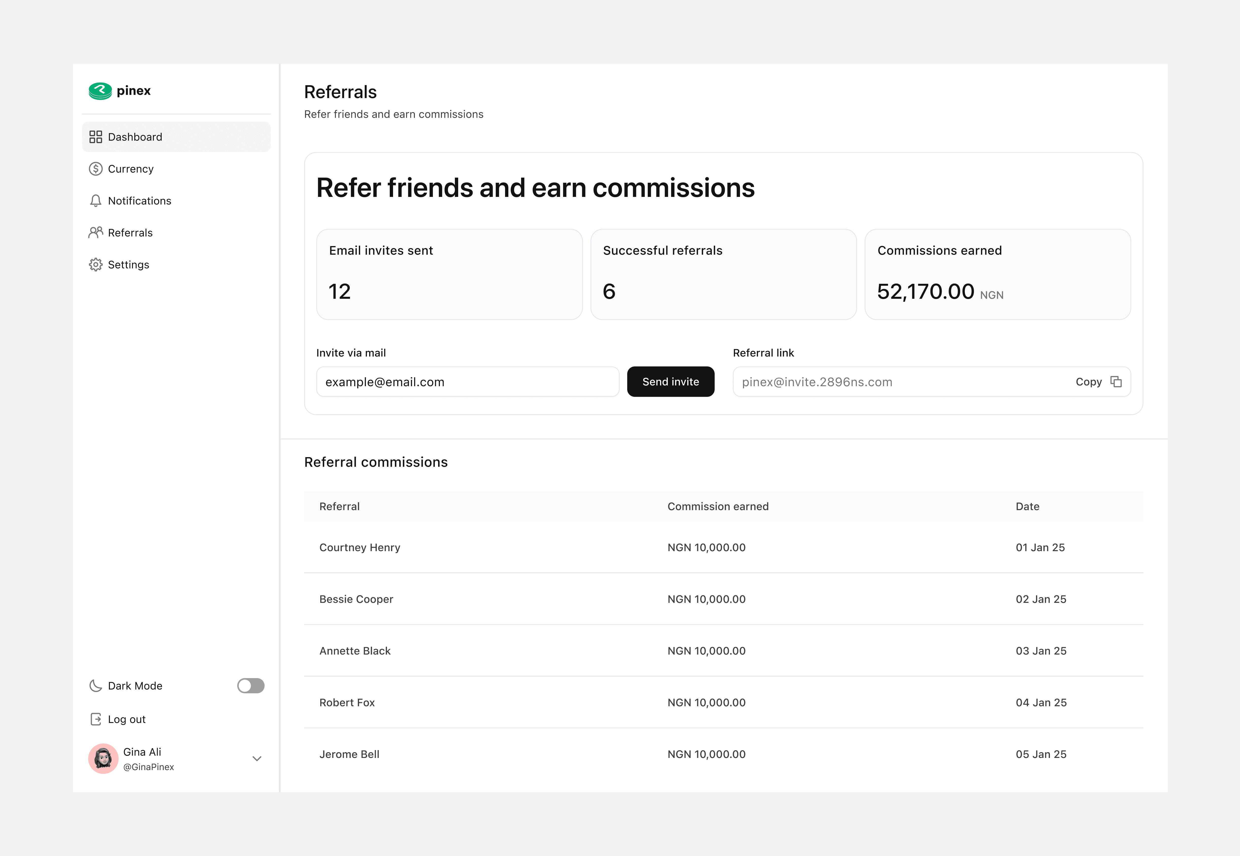
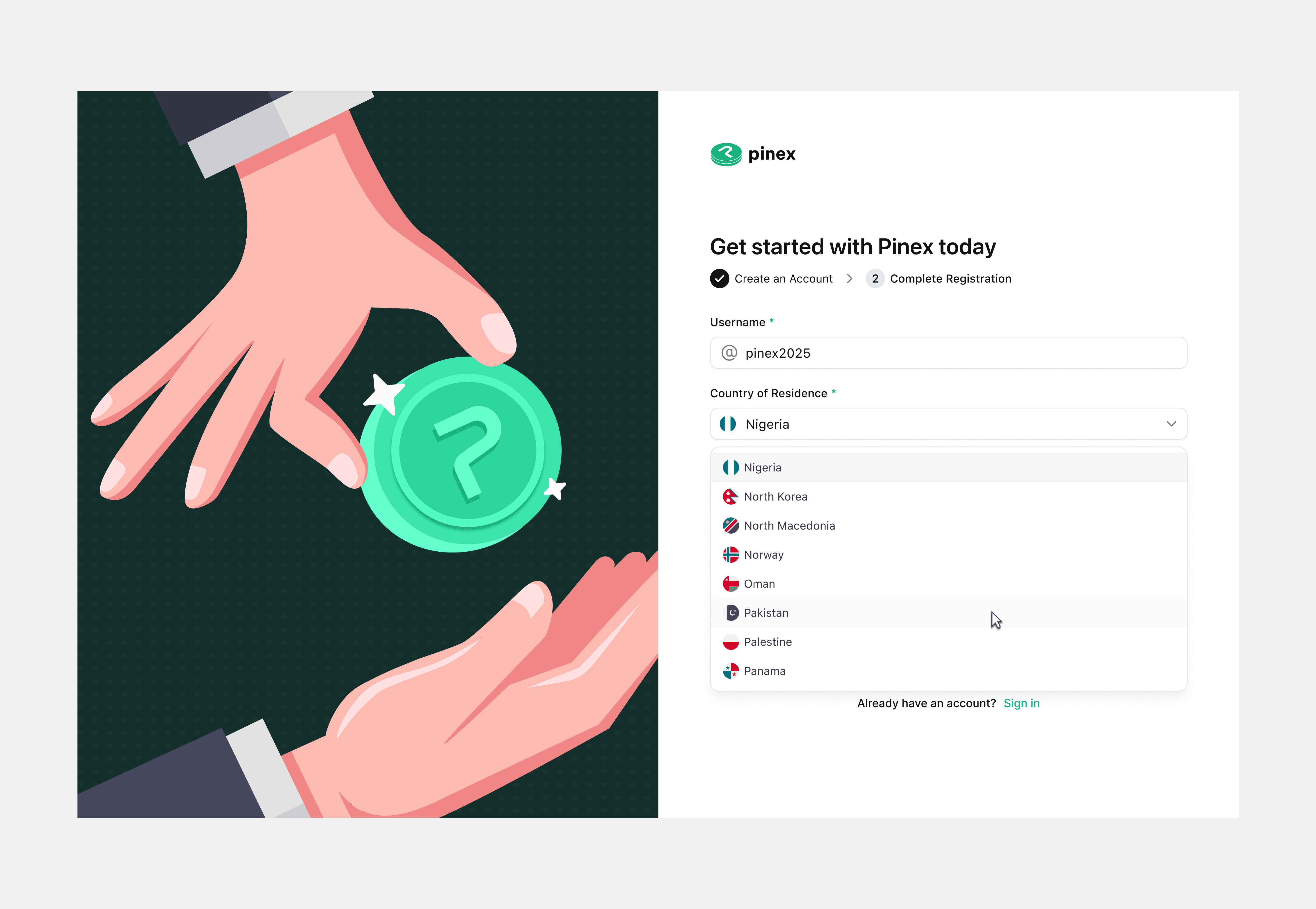
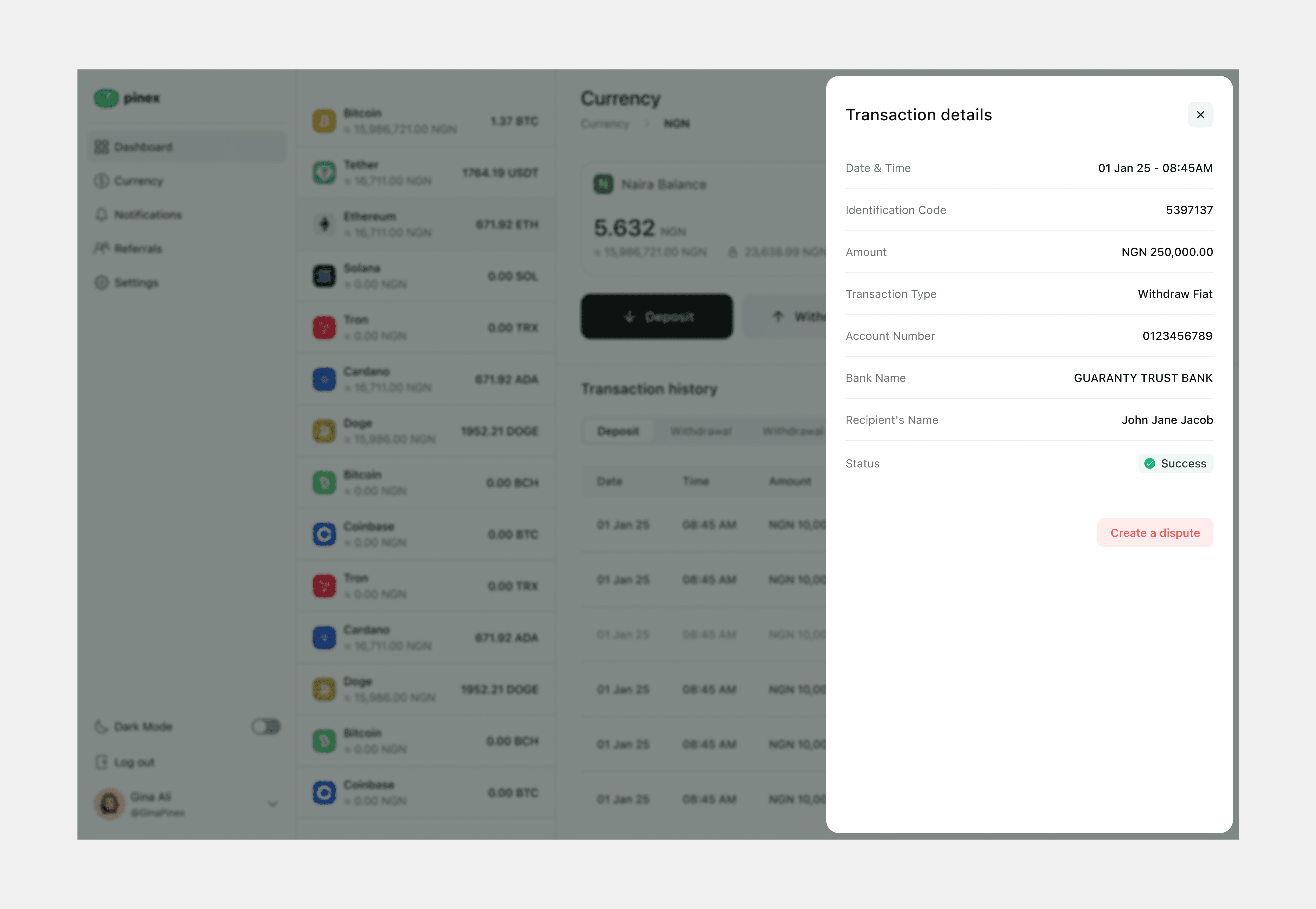
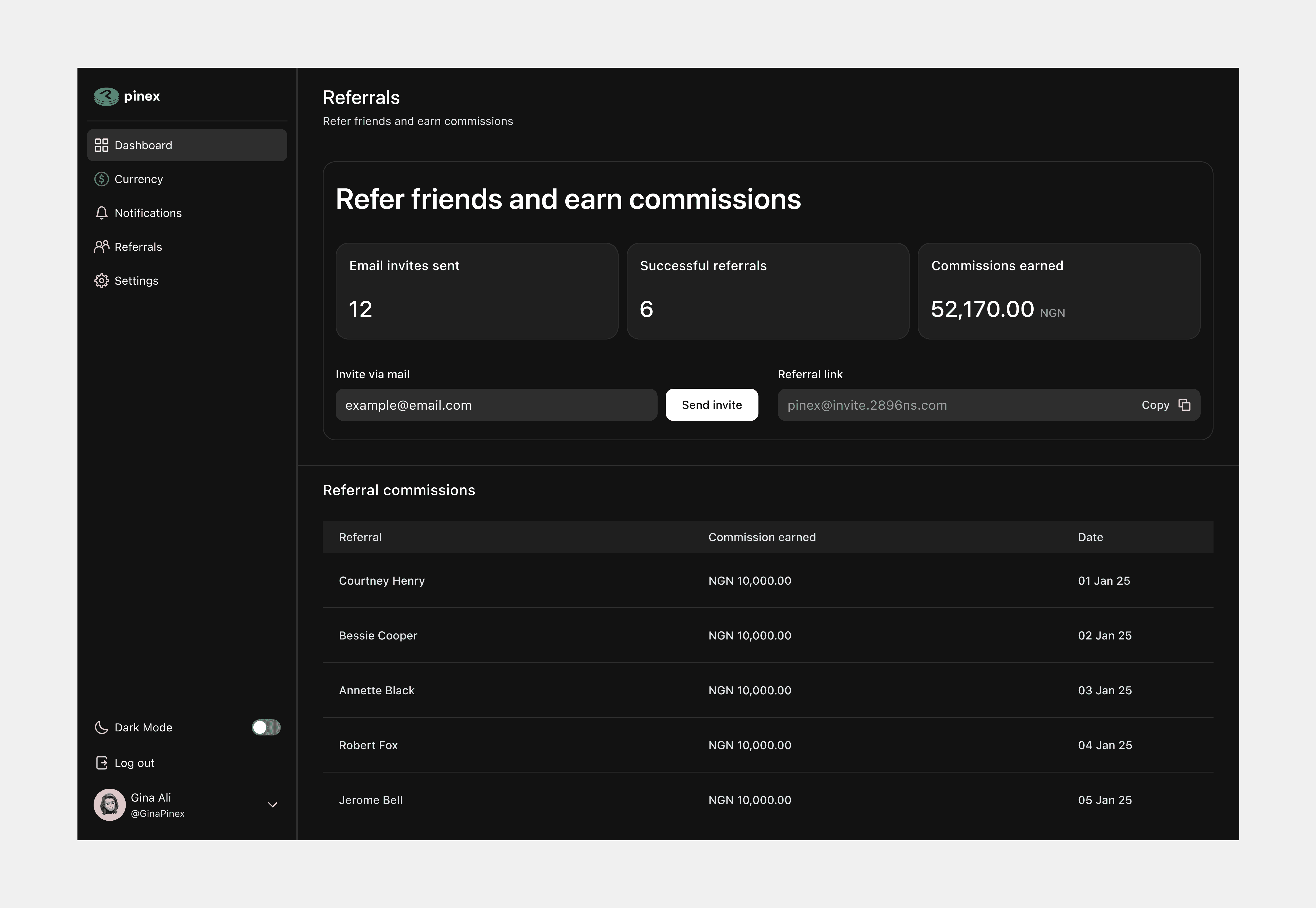
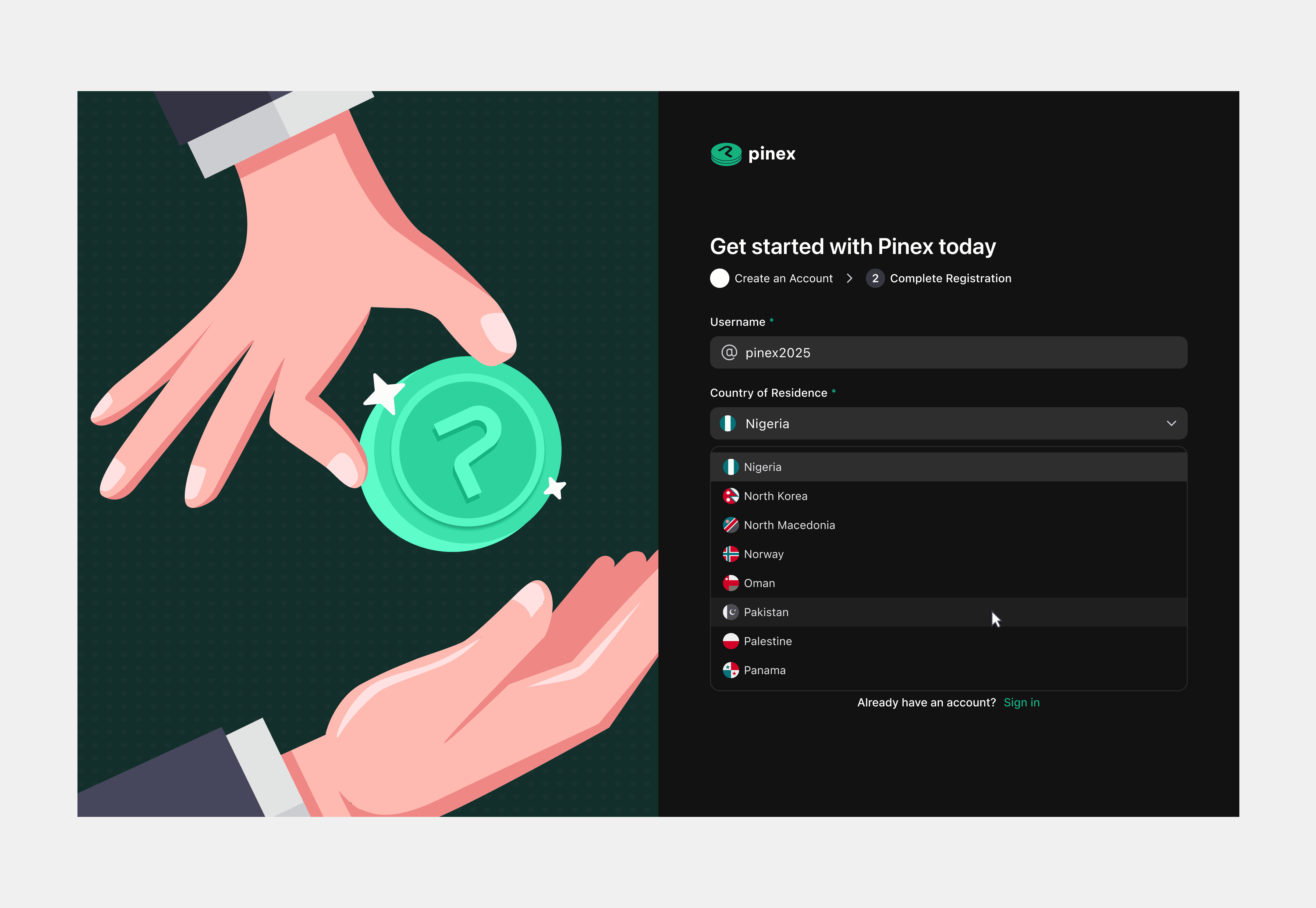
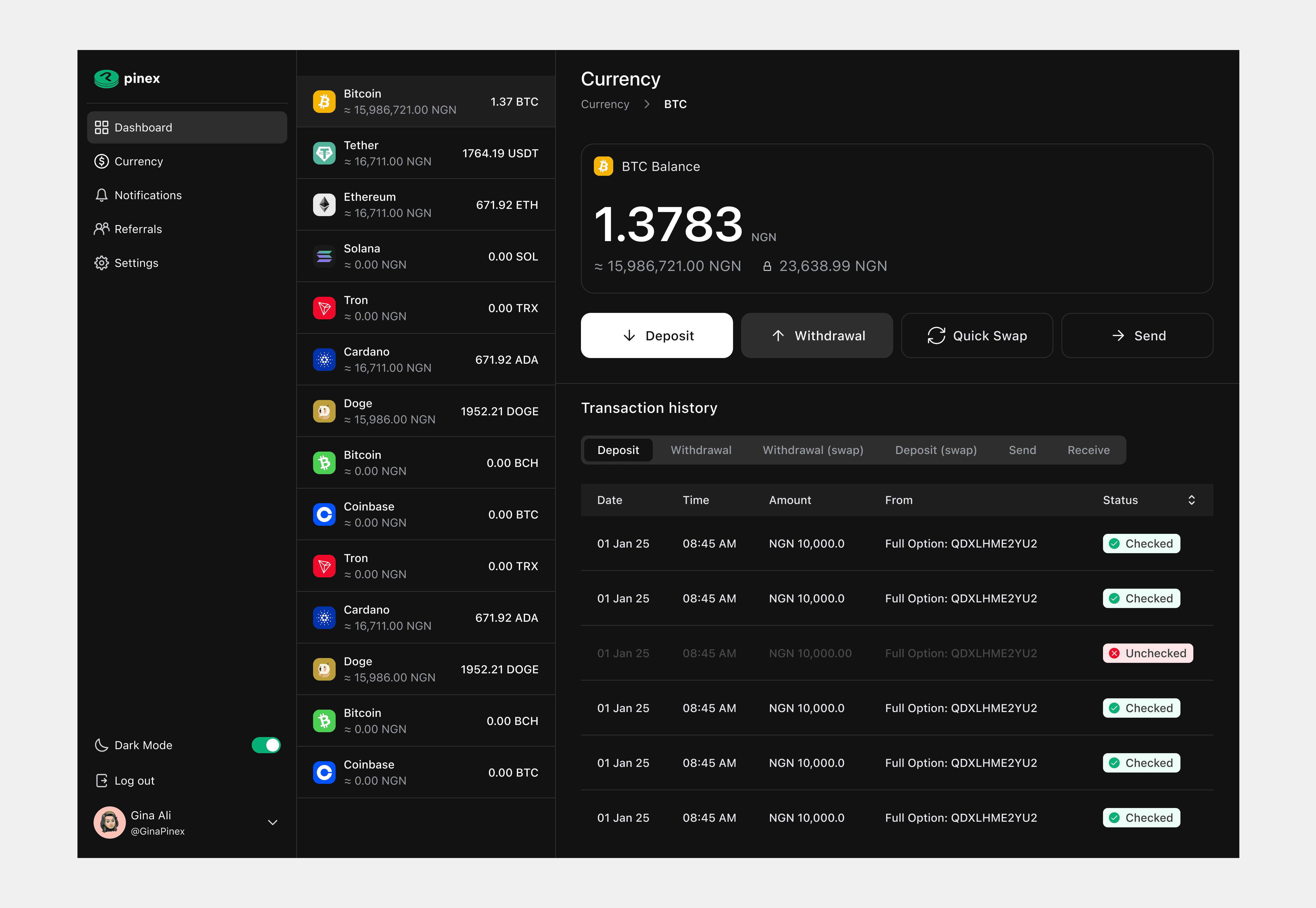
Solution: Designing Crypto Confidence, End-to-End
The solution was an end-to-end experience that made managing multi-currency transactions feel intuitive and stress-free. Progressive disclosure played a key role, surfacing only what users needed at each step while keeping advanced tools just a click away. By combining simplicity with depth, the product delivered clarity for new users and efficiency for power users, building trust in an otherwise complex financial space. • Onboarding & Authentication: Simple flow + referral input. • Dashboard: Progressive disclosure → surface only the most important balances first. • Currency Detail Screens: Deposit, withdraw, send, swap, transaction history. • Swap Flow: Real-time dynamic rates (15-second window). • Referral System: Transparent breakdown of referrals, commissions, and earnings. • Visual Identity: Lightweight, trust-focused branding system.

Results & Impact: No launch, but valuable lessons and recognition
Although the product didn't launch, the project left its mark in other ways. My designs became a clear blueprint for the engineers, and I received strong feedback from both the PM and developers on the usability and clarity of the system. On a personal level, it deepened my understanding of crypto UX patterns and the trade-offs between simplicity and complexity. • Project canceled before launch, so no external KPIs. • Internal impact: - Clear design system that engineers could implement. - Positive feedback from PM and devs on usability + clarity. - Learned new crypto-specific UX patterns and compliance constraints.
Next Steps: From web-first exchange to mobile-first vision
If the project had continued, I would have focused on making Pinex mobile-first and exploring deeper integrations with blockchain and DeFi features. Personally, the experience sparked my interest in crypto design and encouraged me to explore this emerging field further. • If continued: mobile-first adaptation, deeper integration of blockchain/DeFi features. • Personal growth: sparked interest in crypto/blockchain design → expanded knowledge in DeFi UX.
Other projects
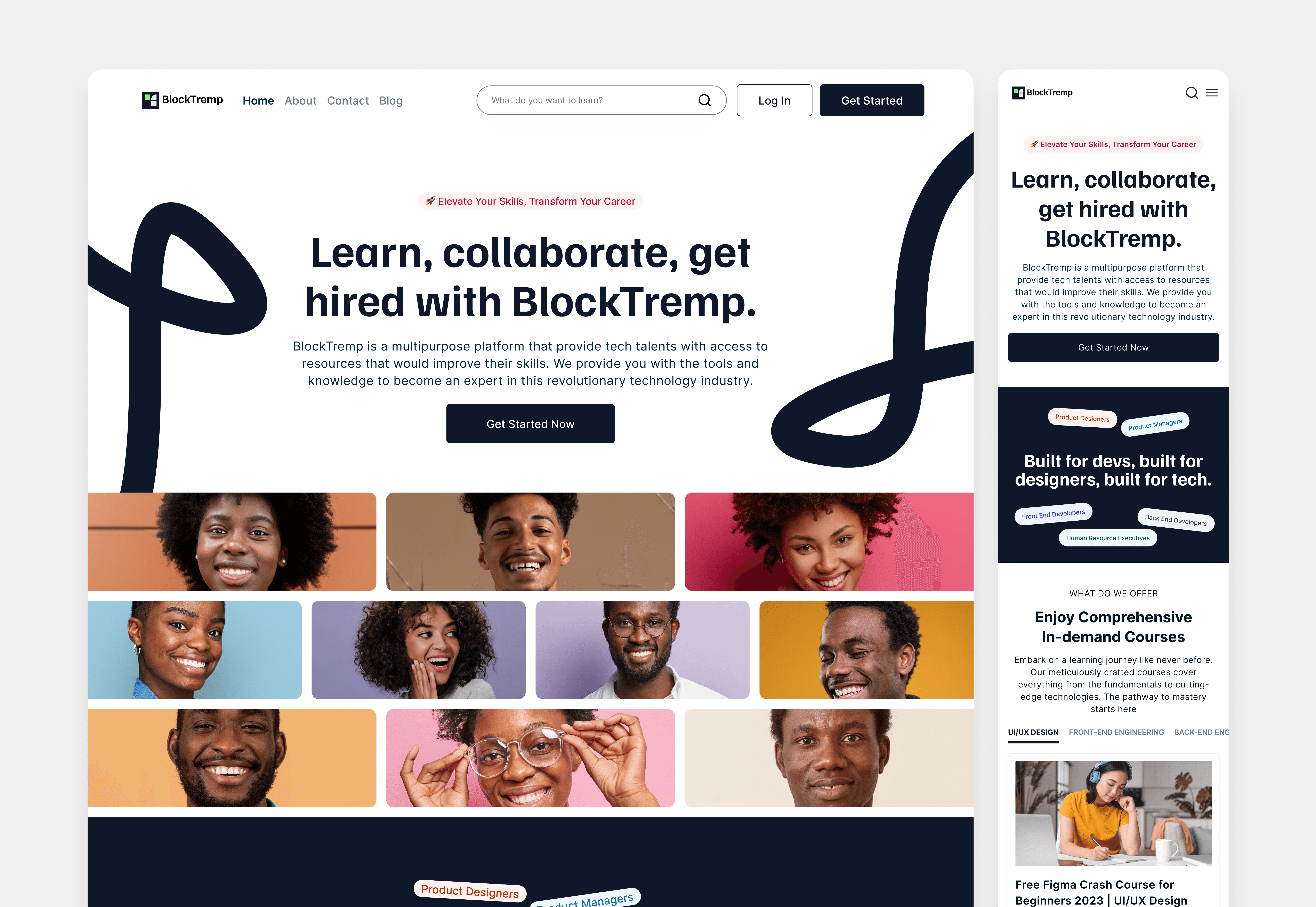
My 2+ Year Journey at BlockTremp, Designing Learning Experiences that Drove Real Results and Industry Recognition
Led Product, Marketing & Brand Design at Africa BlockChain Alliance on a project called BlockTremp; making tech education accessible to everyday users
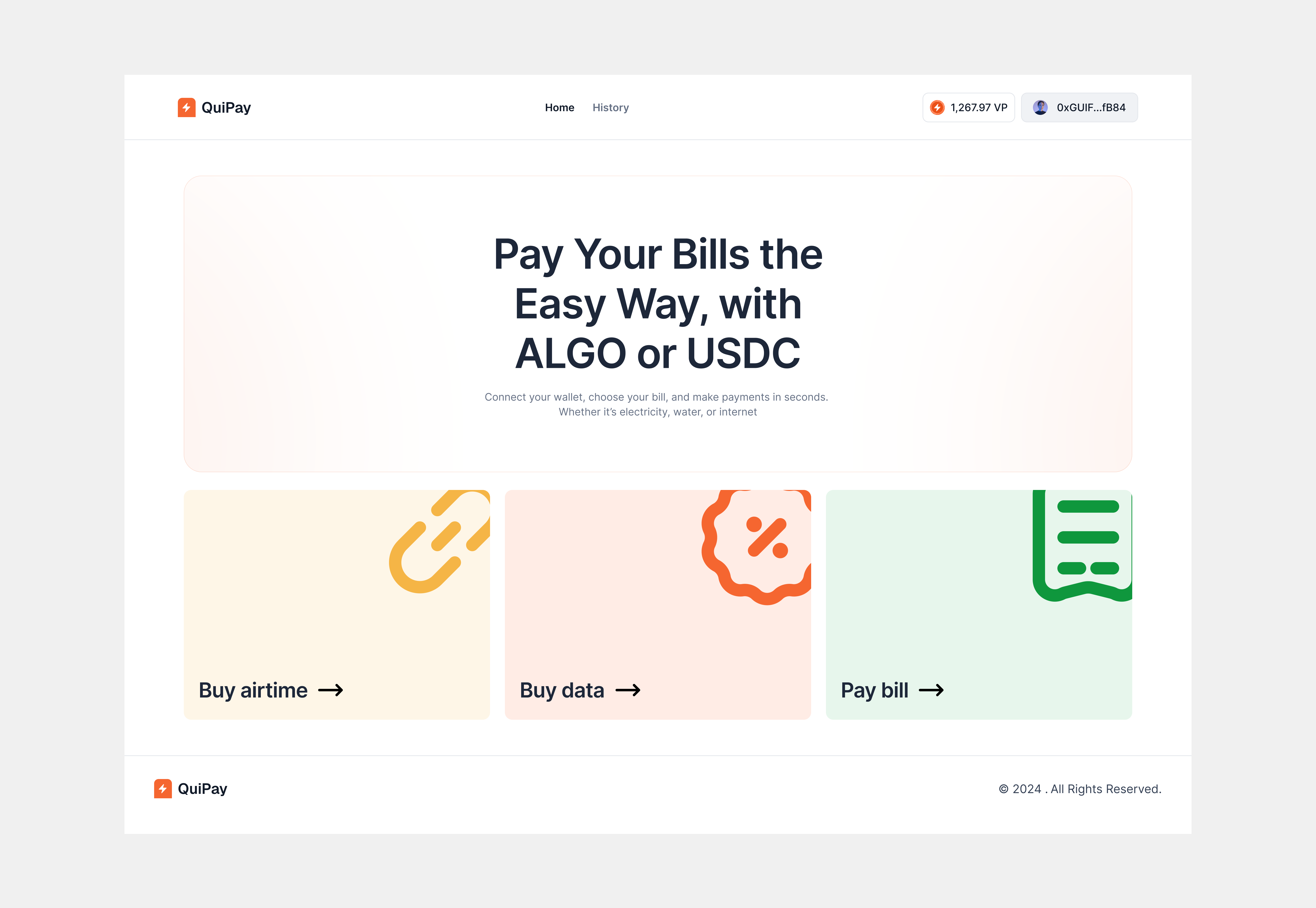
QuiPay – Designing Seamless Everyday Bill Payments with Crypto
Designed QuiPay's fintech experience to simplify payments, boost user confidence, and drive higher transaction completion rates
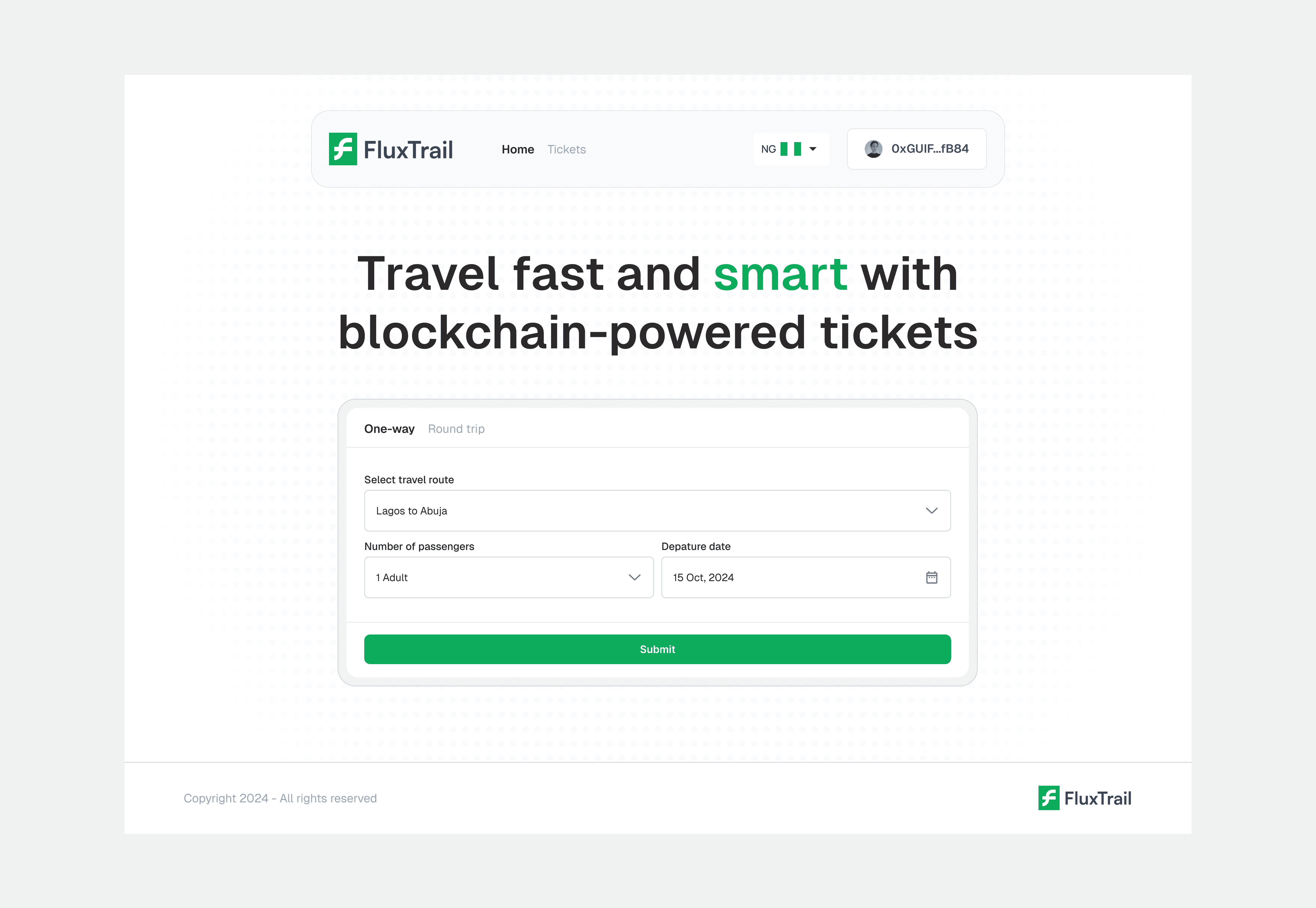
FluxTrail – Decentralizing Transport Ticketing on the Algorand Blockchain
Designed a decentralized transport ticketing platform, streamlining ticket validation, reducing fraud and enabling anonymous travel